Cultural Exchange Design
This project explored how to introduce Canadian women's ice hockey to a Brazilian audience through culturally sensitive, research-led design. Rather than simply translating the sport, the team conducted comparative cultural research across Canadian hockey and Brazilian futebol to understand how sport functions as identity, community, and expression in each context — then developed a multi-deliverable campaign grounded in those findings.
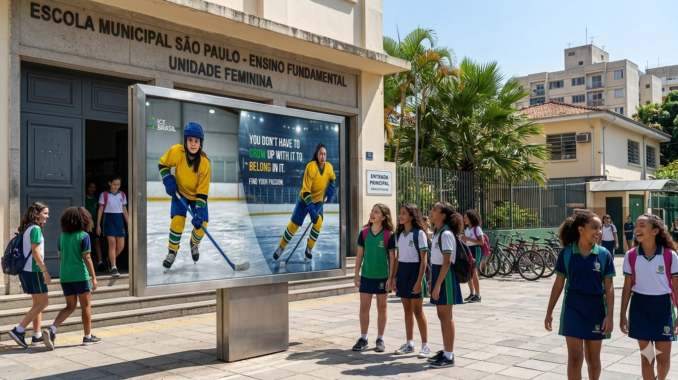
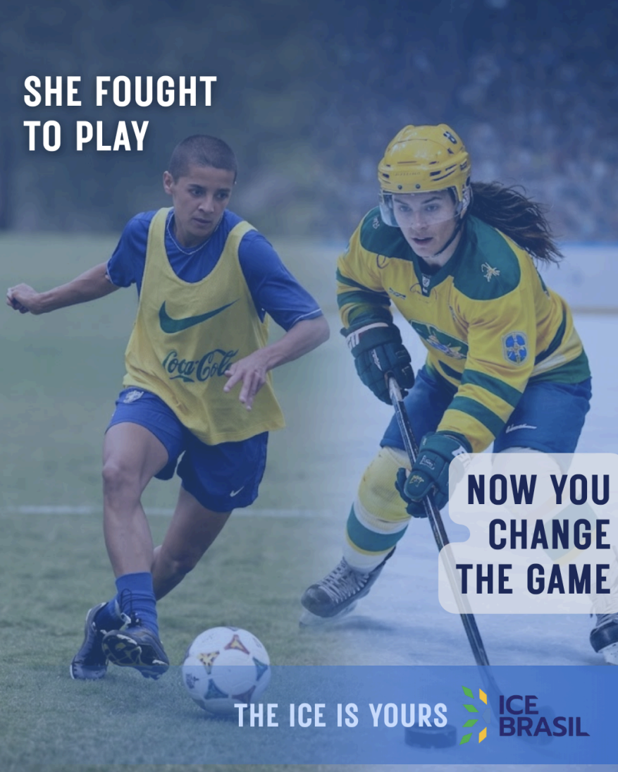
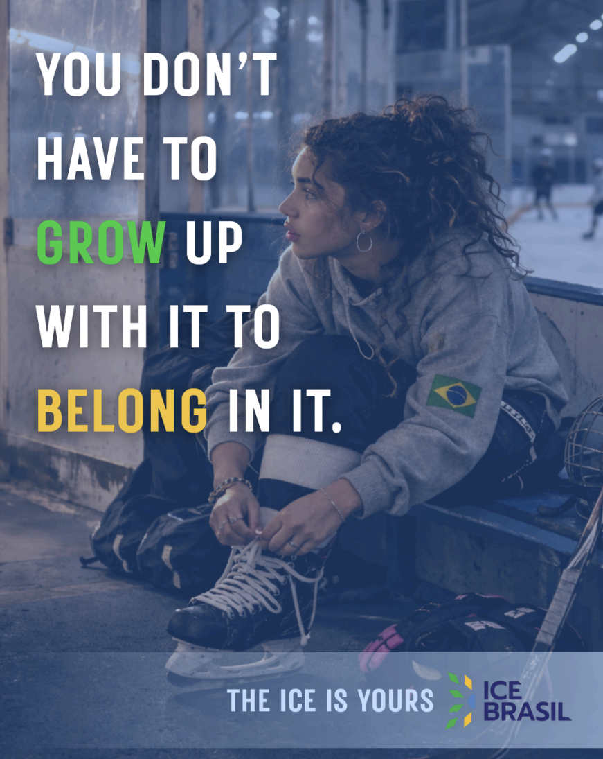
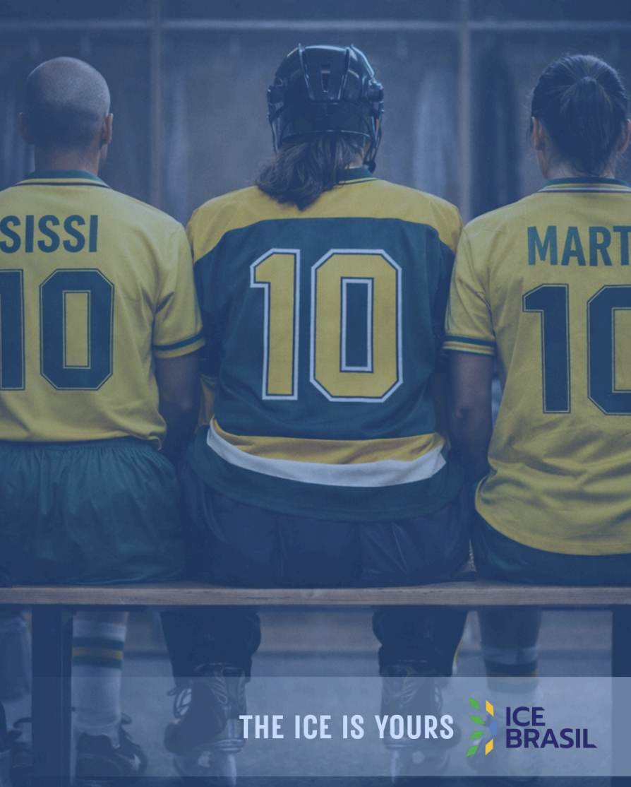
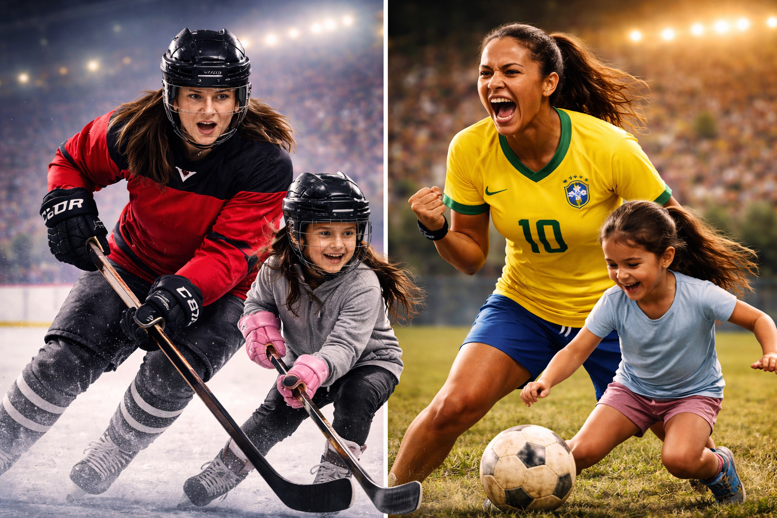
Final Designs.


Problem?
Ice hockey is largely unfamiliar in Brazil, and early design directions risked reducing Brazilian culture to surface-level stereotypes or inadvertently reinforcing colonial dynamics by framing hockey as something being "brought in" from Canada. The project had to find a way to introduce a new sport without cultural imposition.
Solution?
The final campaign, titled "The Ice Is Yours," reframed hockey not as a foreign sport but as a new space for Brazilian women's self-expression and empowerment. By centring shared emotional experiences—anticipation, performance, celebration—and grounding the campaign entirely in a Brazilian visual identity, the work positioned hockey as an opportunity rather than an export.
Tools.
Canva
Social media post design, mood-boarding, initial concept direction development
Adobe Illustrator / Photoshop
Billboard and poster production, visual mockups and final campaign assets
Project Details.
Project: Cultural Exchange—Outbounding a New Sport (Women's Hockey to Brazil)
My Role:
Cultural Researcher
Campaign Designer (Billboard)
Design Strategist
Key Skills Demonstrated:
Cross-Cultural Research & Analysis
Intercultural & Inclusive Design
Campaign Strategy & Concept Development
Ethical Design Decision-Making
Visual Identity Adaptation
Collaborative Design Practice
Software Used:
This project was built across two tools depending on deliverable type. Canva was used for social media post design, early concept exploration, and mood-boarding during the research phase. Final production assets—including the billboard and poster series—were developed in Adobe Illustrator and Photoshop, allowing for greater precision in layout and image treatment across larger-format deliverables.
Takeaways.
The most significant lesson from this project was that surface-level cultural inspiration isn't enough. Our second design direction used Carnaval-inspired visuals, bold colour, and celebration, and it felt well-researched until feedback made clear it was reducing a complex culture to a single recognizable trope. Rethinking that direction entirely was uncomfortable, but it produced a stronger and more respectful outcome.
Removing Canadian visual representation from the final campaign was a deliberate and meaningful decision. Once we recognized that centering both cultures risked framing hockey as something being imported rather than offered, the solution became clear: ground everything in Brazil and let the sport speak for itself within that context.
Designing across cultures requires understanding history, not just aesthetics. The histories of women's sport in both Canada and Brazil, defined by exclusion, resistance, and hard-won visibility, shaped every creative decision we made. That context is what separated the final work from a campaign that just looked culturally aware.