Letterforms & Typography: The Shape of Meaning
This project was a deep exploration into the foundational power of typography, moving beyond mere legibility to understand how the form of a letter can evoke emotion and meaning before a single word is even read. It challenged me to see type not just as a tool, but as a voice.
Problem?
The core challenge was twofold. First, to break away from the digital canvas and rediscover the anatomy of letters in the physical world, proving an understanding of structure and form beyond pre-made fonts. Second, to overcome the common pitfall of choosing typefaces based on personal preference rather than strategic intent, ensuring the visual tone of a word perfectly matches its semantic meaning.
Solution?
My solution unfolded in two key phases. For Found Typography, I became a visual detective, staging and photographing physical objects to spell "CANDLES." This hands-on process honed my eye for letter anatomy—from serifs to counters—by finding these forms in the real world.
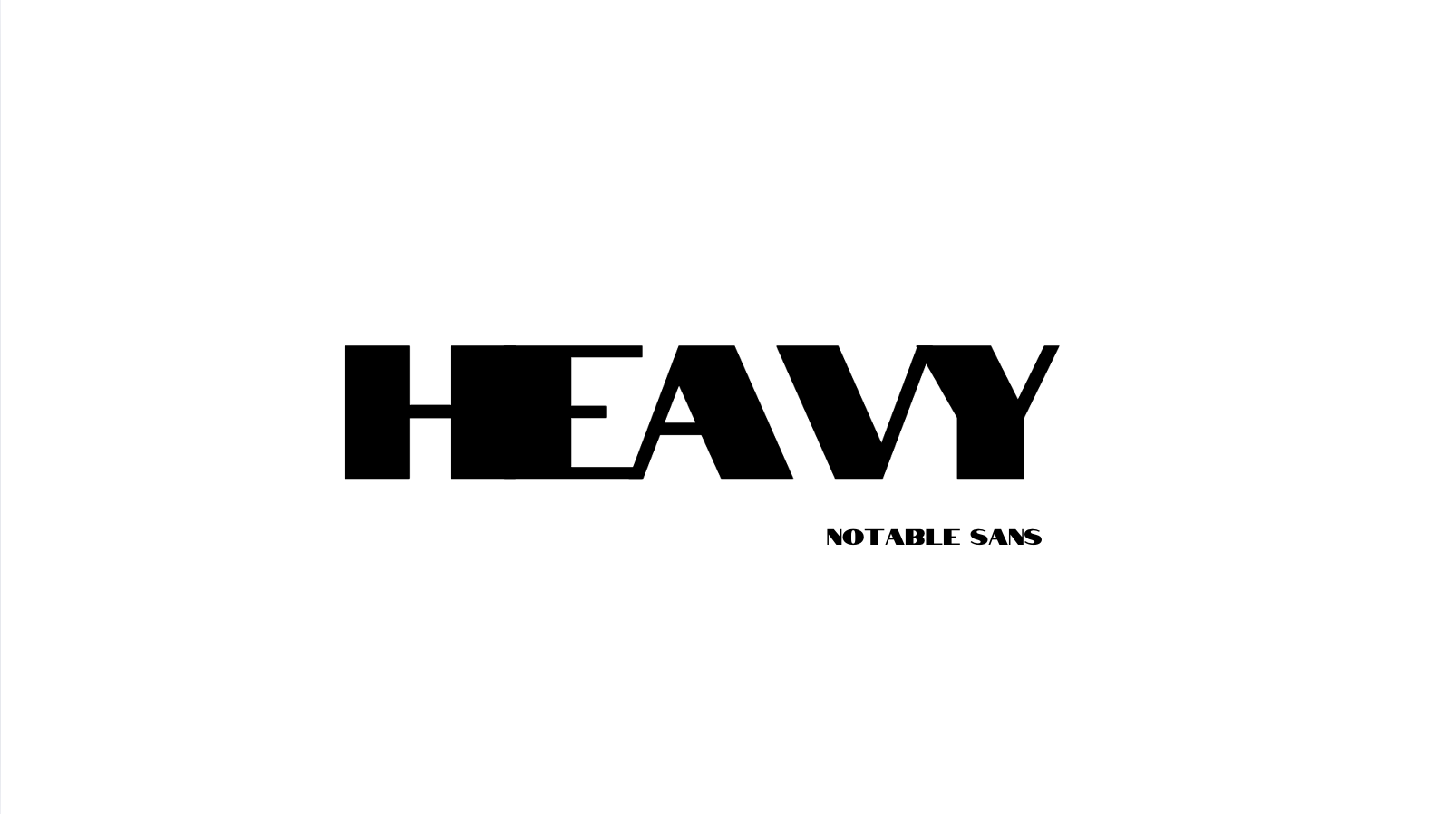
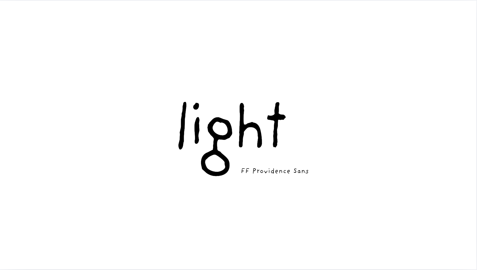
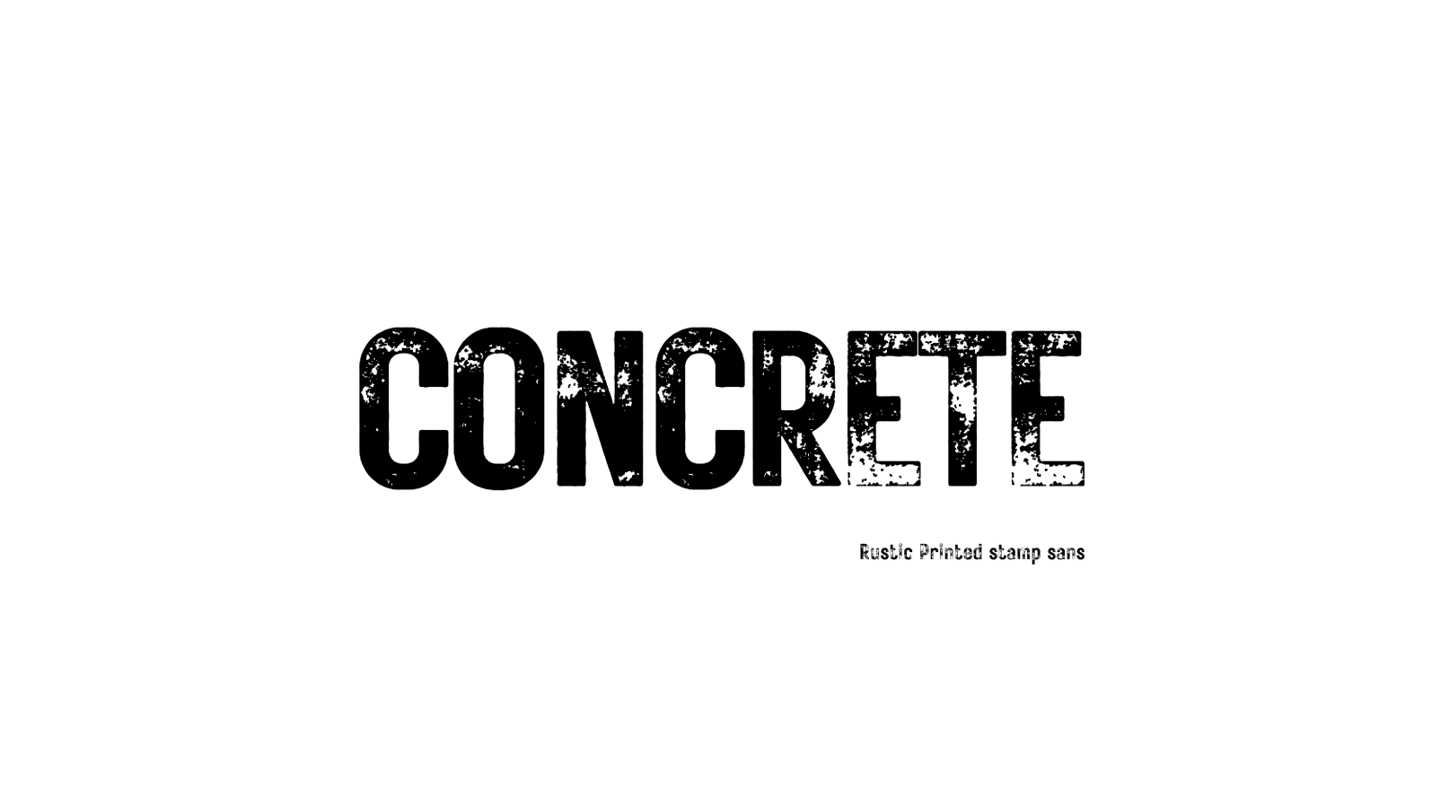
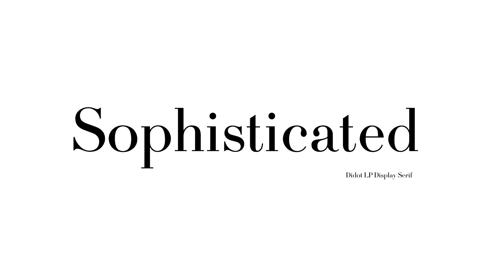
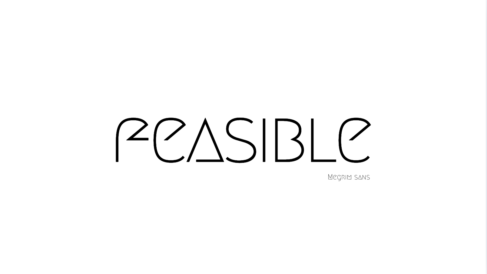
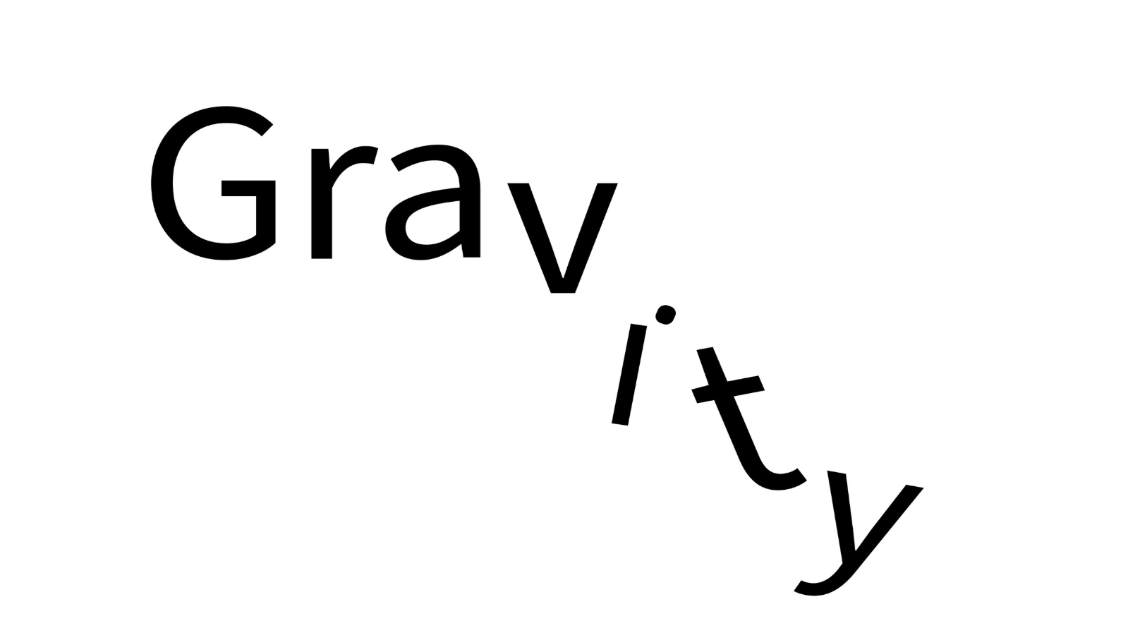
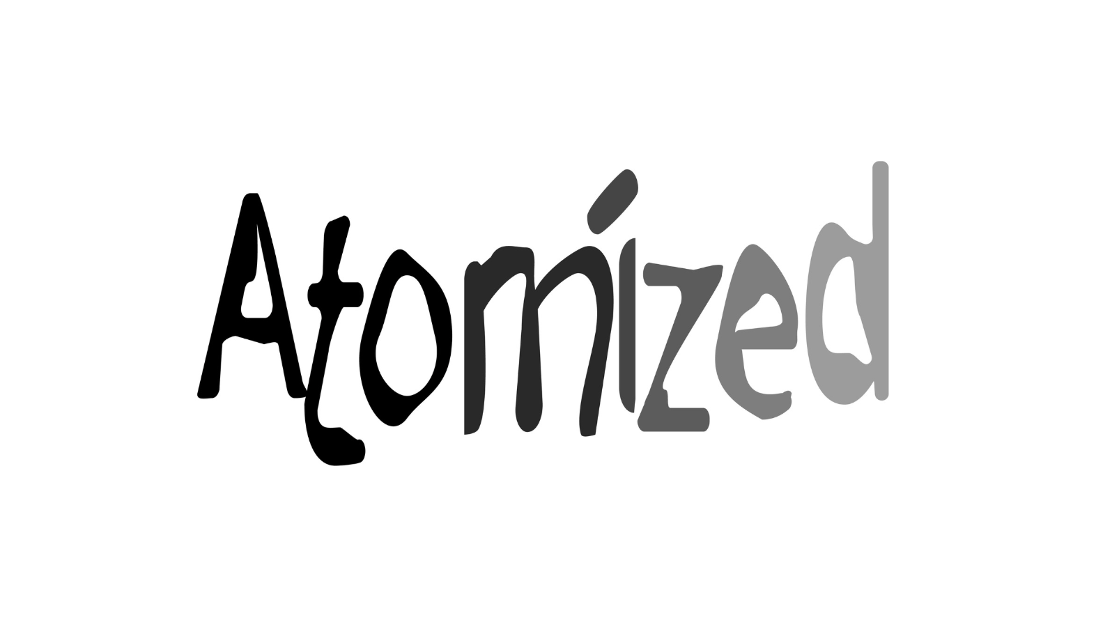
For the Semantic Studies, I used a systematic approach to pair words with their perfect typographic voice. This involved mastering the nuances of typefaces, using a high-contrast serif like Didot for "Sophisticated," a distressed sans-serif for "TERRIBLE," and a bold, condensed weight for "HEAVY." Every kerning, tracking, and font choice was a deliberate decision to make the word feel its meaning.


Tools
The project was executed using Adobe Fonts for its extensive library and precise typographic control, Figma for layout and experimentation with the semantic studies, and Canva for assembling the final presentation. The "CANDLES" piece was created through physical staging and photography.
Project Details
Project: Letterforms & Semantic Typography
Key Skills Demonstrated:
Typographic Anatomy & Hierarchy
Semantic & Conceptual Thinking
Found Object Photography & Staging
Intentional Typeface Selection
Kerning and Tracking
Software & Tools Used:
Adobe Fonts
Figma
Canva
Photography
Project Insight:
"This project confirmed that great design is not intuitive, but intentional. Every stroke, weight, and contrast choice must serve the word's message."