Visual Content System
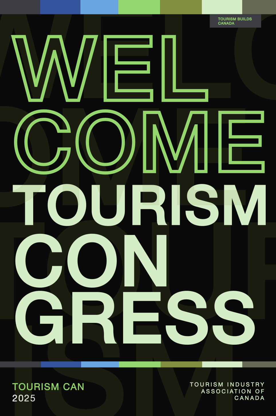
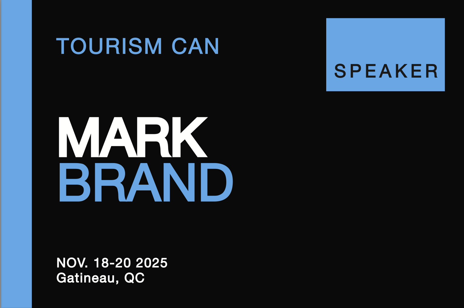
This project involved designing a complete visual identity system for the Tourism Industry Association of Canada's 2025 national congress—a three-day event hosting over 1,400 delegates from every province and territory. The scope covered five distinct deliverables: a 36-page conference booklet, session posters, a schedule overview, name tags, and a welcome poster. The central design challenge was ensuring that every piece of collateral functioned cohesively as a system while remaining independently legible under real conference conditions.
Final Designs.


Problem?
Delegates navigating a dense, multi-day program need to orient themselves quickly, often in under 30 seconds while moving between sessions. The design system had to prioritize way-finding and legibility above all else, without sacrificing the authority and energy appropriate for a national industry event.
Solution?
A colour-per-day way-finding system where each stage of the congress was assigned a dedicated palette—allowing delegates to identify their location in the program before reading a single word. Functional colour decisions were supported by a strict typographic hierarchy and three adaptive grid modes across all deliverables.
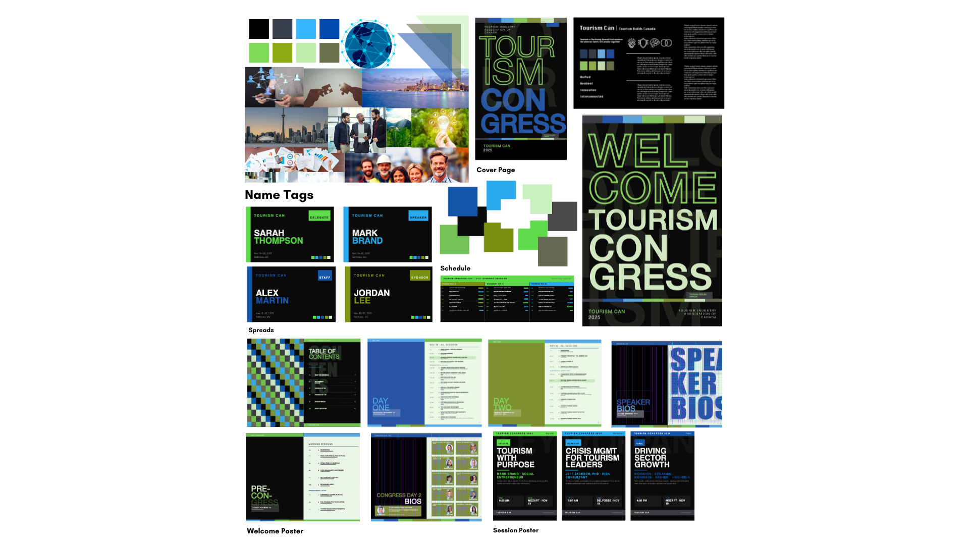
One thread running through every piece of collateral.
Tools.
Adobe InDesign
Primary production environment—booklet layout, session posters, schedule overview, name tags, welcome poster, and style guide documentation
Canva
Early-stage colour exploration and mood-boarding—palette testing across deliverable formats before moving into full production
Project Details.
Project: TIAC Tourism Congress 2025—Visual Identity System
My Role:
Visual Identity Designer
Brand Systems Designer
Layout & Production Designer
Key Skills Demonstrated:
Visual Identity & Brand System Design
Way-finding & Information Architecture
Colour Theory & Functional Colour Systems
Multi-Deliverable Layout Design
Typography Hierarchy & Grid Systems
Accessibility & Inclusive Design
Style Guide Documentation
Software Used:
This project followed a two-stage production process. Early colour exploration and palette validation were conducted in Canva, where the five-colour system was tested across each deliverable format before committing to a direction. All final production—the booklet, session posters, schedule overview, name tags, welcome poster, and accompanying style guide—was built and refined in Adobe InDesign, which served as the primary design environment throughout the project.
Takeaways.
This project reinforced that good system design starts with the user's environment, not the canvas. Designing for a conference hallway—not a screen—shaped every decision.
The strongest decisions were the ones where function and concept were the same thing. Colour navigated the program and expressed the theme simultaneously.
And the clearest lesson: define every system element before production begins. The icon set came in late, and it showed.