Wire-framing Design Sprint
For this project, I worked through six wire-framing scenarios set across six different decades—starting with a 1995 web directory and ending with a 2030 autonomous vehicle dashboard. The goal wasn't just to sketch out layouts; it was to actually think like a user from that era and let those constraints drive every design decision.
Final Designs.
Mission 1
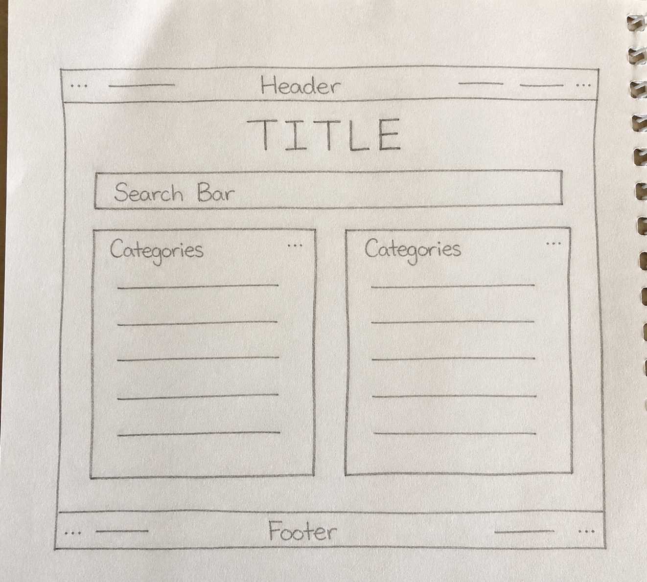
Finding the Web — low fidelity (Hand-drawn)
Search engines weren't reliable yet, so I leaned into a web directory layout — lots of categories, minimal graphics, nothing that would slow down a dial-up connection.
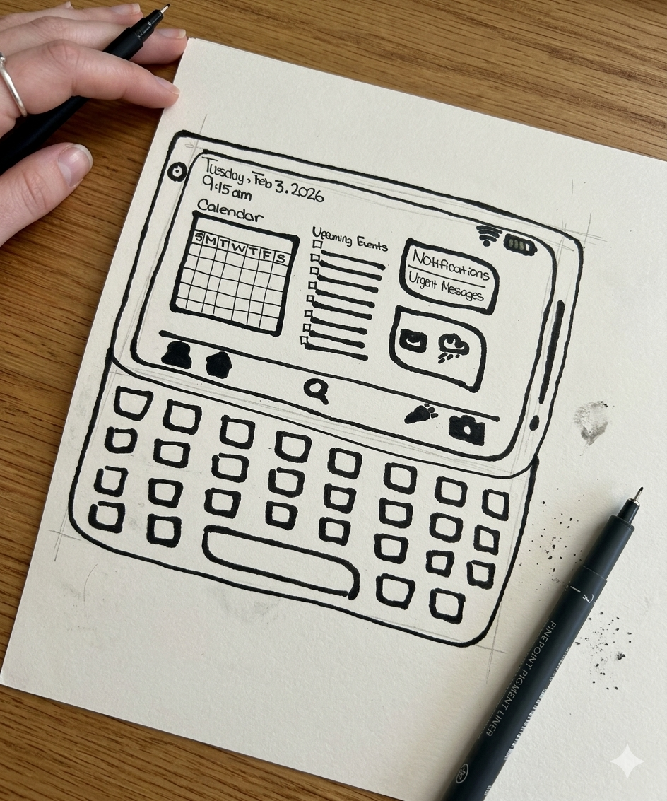
Life in Your Pocket — low-mid fidelity (Hand-drawn)
Early PDAs were all about squeezing utility into a tiny screen. I included a physical keyboard in the sketch because that tactile element really defined how people interacted with these devices.
Mission 2
Mission 3
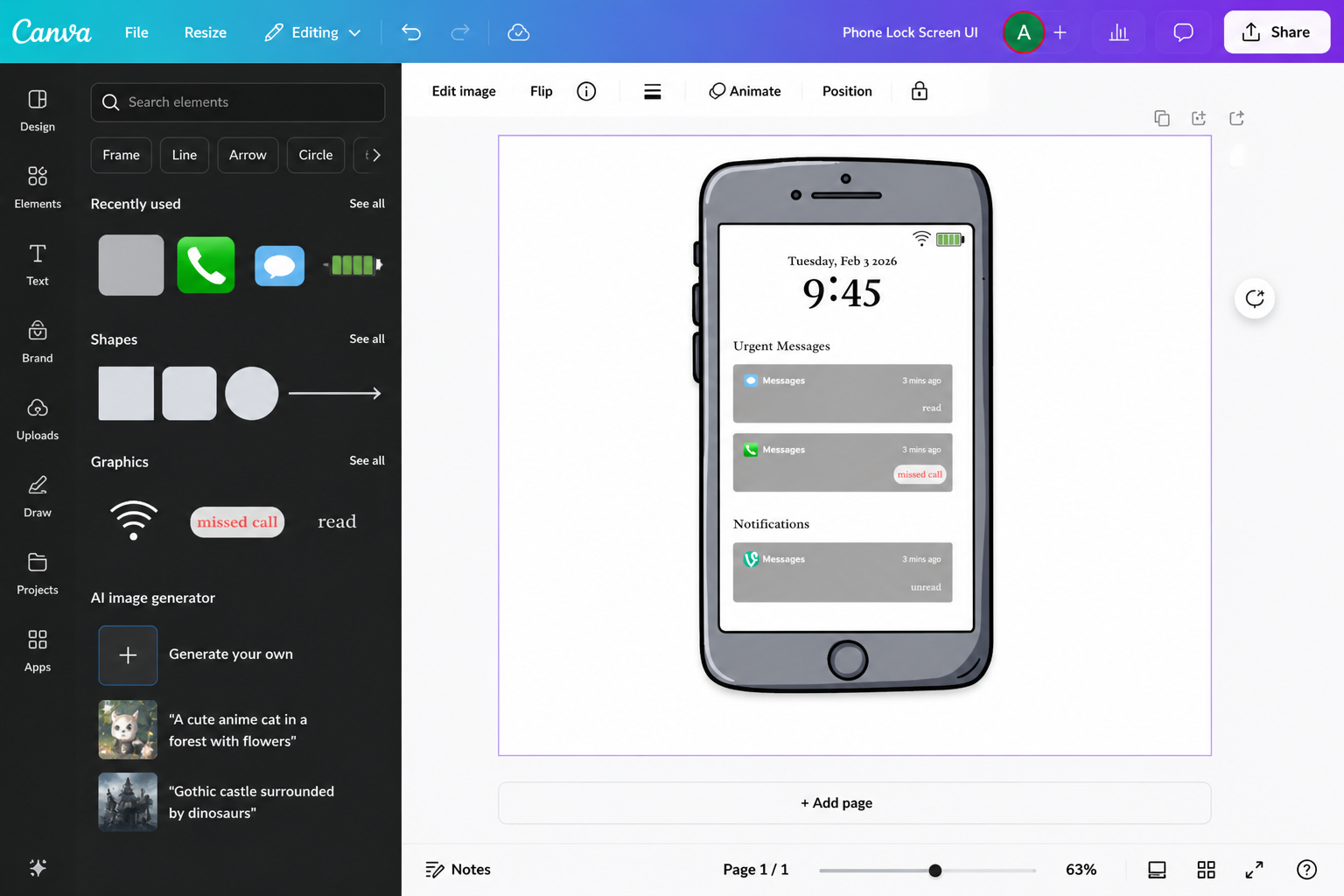
Too Much Too Fast — mid fidelity (Canva)
By 2012 everyone's phone was constantly buzzing. I focused on visual hierarchy to separate what actually needed attention from everything else, the design pattern we now take for granted on lock screens.
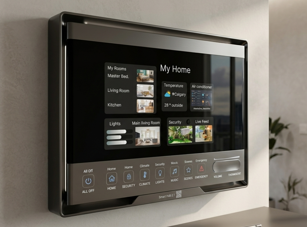
Control the Home — mid-high fidelity (Figma)
Smart home controls needed to feel trustworthy, mistakes here have real-world consequences. I kept the layout simple and made the toggles very deliberate, with a live security feed to show the system was actually working.
Mission 4
Mission 5
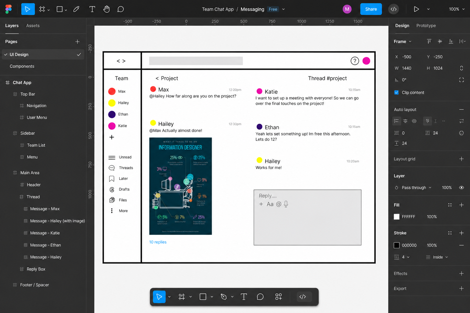
Work Without Walls — mid fidelity (Figma)
Remote work meant juggling teams, threads, and tasks all at once. I modelled this after platforms like Slack—a multi-pane layout where nothing important gets buried.
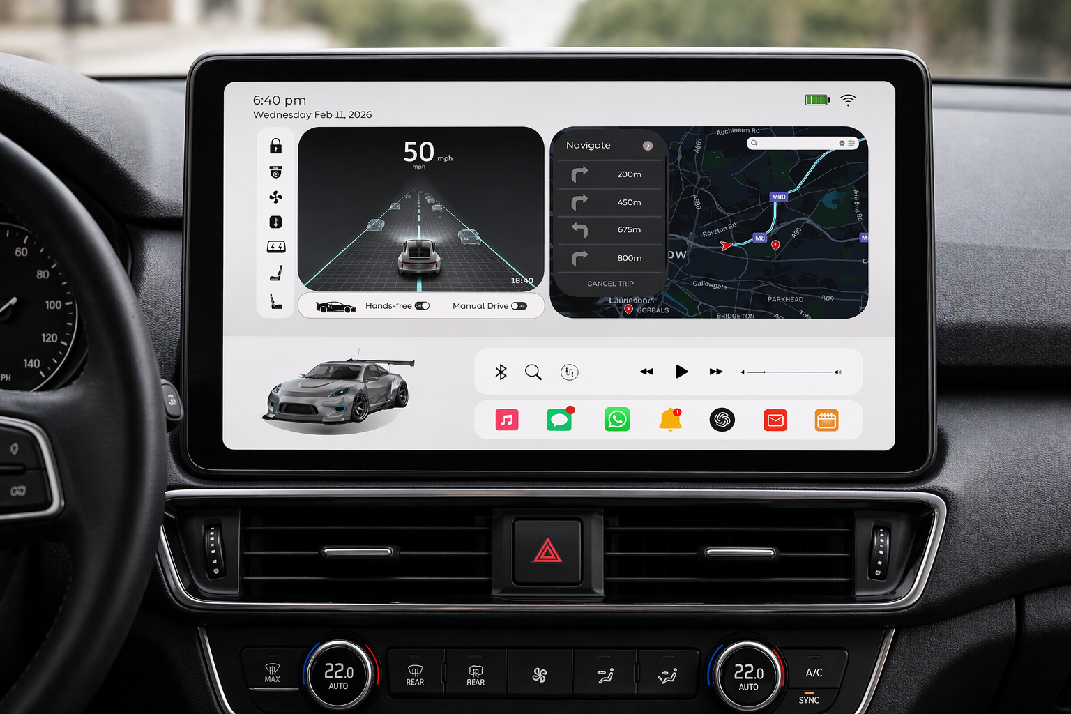
No One Is Driving — high fidelity (Canva)
When you're not driving, the car becomes a living space. I prioritized letting passengers see what the AI was doing— road visualization front and centre—while keeping entertainment and nav within easy reach.
Mission 6
Problem?
Each era came with its own set of rules—slow internet, tiny screens, notification overload, smart home anxiety. The hard part was resisting the urge to design for 2026 and actually working within the limitations of the time.
Solution?
I started each mission by asking what frustrated users most in that moment, then built around that problem. Less about aesthetics, more about what the interface actually needed to solve at the time.
Tools.
This project followed a mission-by-mission design process, moving from hand-drawn low-fidelity sketches through to polished high-fidelity screens. The wire-framing and UI flow for each era were developed in Figma, while the visual presentation and portfolio layout were put together in Canva. Early-stage sketches for the 1995 and 2003 missions were done with paper and pen, keeping the fidelity intentionally rough to match the constraints of those eras.
Project Details.
Project: Wire-framing Design Sprint
My Role:
UX Researcher
UI Designer
Key Skills Demonstrated:
Historical UX Research & Context Analysis
Low-to-High Fidelity Wireframing
Era-Appropriate Constraint Design
Visual Hierarchy & Information Architecture
Multi-Tool Adaptability
Reflective Design Practice
Software Used:
Figma — mid & high fidelity wireframing
Canva — visual design & portfolio layout
Paper & pen — low fidelity hand-drawn sketches
Takeaways.
Design clutter usually isn't bad taste it's a symptom of the technology available. 1995 was cluttered because search didn't work yet. 2012 was cluttered because suddenly everything could notify you about everything.
The hardest part of this project was genuinely unlearning modern UX conventions. Designing the 1995 layout required me to stop assuming users knew what a search bar was for.
Figma was my go-to for anything that needed precision—especially the component-heavy missions. Canva worked really well for the higher-fidelity visual stuff where I wanted to move faster.
Wire-framing isn't just about layout—it's about understanding what was actually bothering people at a given moment in time, and designing around that.